")


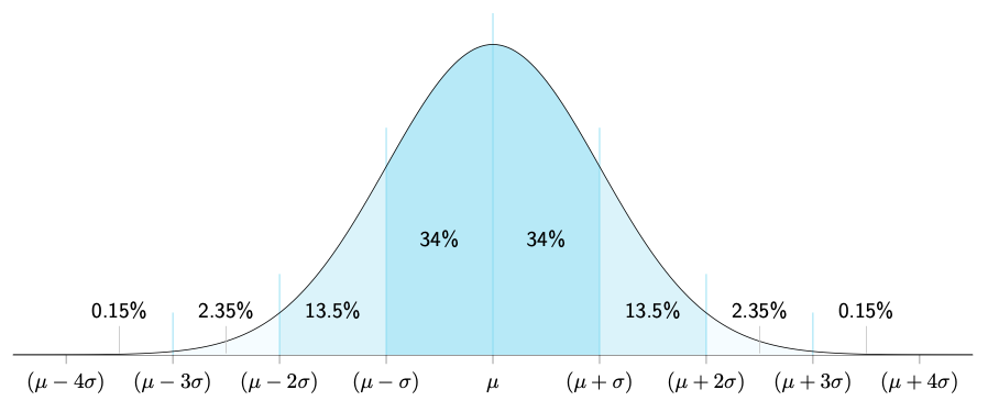
The Normal Distribution is a bell-shaped curve where most data points gather around an average value, showing symmetry and a tendency for values to decrease as they move away from the mean. It’s a fundamental concept in statistics, representing common patterns in various real-world phenomena.
\documentclass[border=10pt]{standalone}
\usepackage{pgfplots}
\pgfplotsset{compat=1.18}
\usepgfplotslibrary{fillbetween}
\tikzset{every node/.style={font=\sffamily}}

\definecolor{linecolor}{HTML}{7AD7F0}
\definecolor{grad1}{HTML}{92DFF3}
\definecolor{grad2}{HTML}{B7E9F7}
\definecolor{grad3}{HTML}{DBF3FA}
\definecolor{grad4}{HTML}{F5FCFF}

\begin{document}
\begin{tikzpicture}
  \begin{axis}[
    width = 17.5cm,
    height = 7.25cm,
    xmin = -4.5, xmax = 4.5,
    ymin = 0,
    axis x line* = bottom, % the * suppresses the arrow tips
    hide y axis,
    xtick = {-4,...,4},
    % xtick = {0},
    % tick label style = {color=white}, % uncomment this line and change all other
    % xtick tags to remove x-axis markings
    xtick align = outside,
    xticklabels = {$(\mu-4\sigma)$, $(\mu-3\sigma)$, $(\mu-2\sigma)$,
      $(\mu-\sigma)$, $\vphantom{(}\mu$, $(\mu+\sigma)$, $(\mu+2\sigma)$,
      $(\mu+3\sigma)$, $(\mu+4\sigma)$}, % comment this if uncomment above;
        %commenting this without uncommenting above makes markings integers
  ]
  % This draws the vertical lines
  \pgfplotsinvokeforeach {-3,-2,-1,0,1,2,3} {
    \draw[linecolor, thin] (axis cs: #1,-1)
      -- (axis cs: #1,{(1/sqrt(2*pi))*exp((-1/2)*(#1)^2)+0.05});
  }

  % This draws the main curve
  \addplot [
    domain = -4.5:4.5,
    samples = 251,
    color = black,
    name path = dist
  ]
  {(1/sqrt(2*pi))*exp((-1/2)*x^2)};

  % This is necessary for the filling later
  \path [name path = base] (\pgfkeysvalueof{/pgfplots/xmin},0)
    -- (\pgfkeysvalueof{/pgfplots/xmax},0);

  % This labels each section
  \node at (axis cs: -0.5,0.15) {34\%};
  \node at (axis cs: 0.5,0.15) {34\%};
  \node at (axis cs: -1.5,0.058) {13.5\%};
  \node at (axis cs: 1.5,0.058) {13.5\%};
  \node[inner sep=0, pin={[pin edge={lightgray}]90:2.35\%}] at (axis cs: -2.5,0.0) {};
  \node[inner sep=0, pin={[pin edge={lightgray}]90:2.35\%}] at (axis cs: 2.5,0.0) {};
  \node[inner sep=0, pin={[pin edge={lightgray}]90:0.15\%}] at (axis cs: -3.5,0) {};
  \node[inner sep=0, pin={[pin edge={lightgray}]90:0.15\%}] at (axis cs: 3.5,0) {};

  % This is where we fill in the regions
  \addplot [white] fill between [of = dist and base, soft clip = {domain=-4:4}];
  \addplot [grad4] fill between [of = dist and base, soft clip = {domain=-3:3}];
  \addplot [grad3] fill between [of = dist and base, soft clip = {domain=-2:2}];
  \addplot [grad2] fill between [of = dist and base, soft clip = {domain=-1:1}];
\end{axis}
\end{tikzpicture}
\end{document}


